When it is dark enough, you can see the stars.
―
Table of Contents
- Introduction
- Reasons for Dark Mode
- Visual Attraction
- User Experience
- Eye Strain & Blue Light Removal
- Reduction of Photophobia
- Battery Saver
- Factors to Consider When Selecting Dark Mode
- Conclusion
Introduction
According to an American survey, children between the ages of 8-12 and 13-18 spend a daily average of 4 hours, 44 minutes and 7 hours, 22 minutes respectively, staring at screens.
The data for these numbers were collected in 2019. For adults, this figure is higher and according to an article on the Washington Post earlier this year, the amount of screen time increased considerably during the quarantine period due to COVID-19
Today, mobile devices take a large percentage of the amount of time people spend staring at screens, this is why there is a need for applications to have a Dark Mode option for its users.
Dark Mode according to Wikipedia, is a color scheme that uses light-coloured text, icons, and graphical user interface elements on a dark background and is often discussed in terms of computer user interface design and web design.
Now, let us look at the 5 reasons why Dark Mode really matters for the end-users of an application!
Reasons For Dark Mode
1). Visual Attraction
Dark Mode when applied in the right manner always looks really appealing to the eye. It provides the opportunity to present a unique user interface to the end-users of an application.
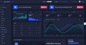
Also, in terms of data presentation for graphical contents like dashboards that contain graphs and charts, Dark Mode brings out the elegance in the design as shown below.

Unlike the drab white look that most applications have, the above image shows how Dark Mode can bring a significantly deeper and more attractive visual perception to an application.
2). User Experience
Providing the users of a product with the option of a Dark Mode is a good business decision, especially if the application requires users to spend lots of time on the application. A streaming site, for example, implementing a dark mode feature is a good business decision.
Streaming a video in light-mode under a dark environment or at night may not be a good experience for the eyes. Hence, applications that require people spending lots of screen time should provide an option for Dark Mode for a better user experience.
Above all, it is worthy to note that context is a key factor in making decisions on whether to implement the option of a Dark Mode.
3). Eye Strain & Blue Light Removal
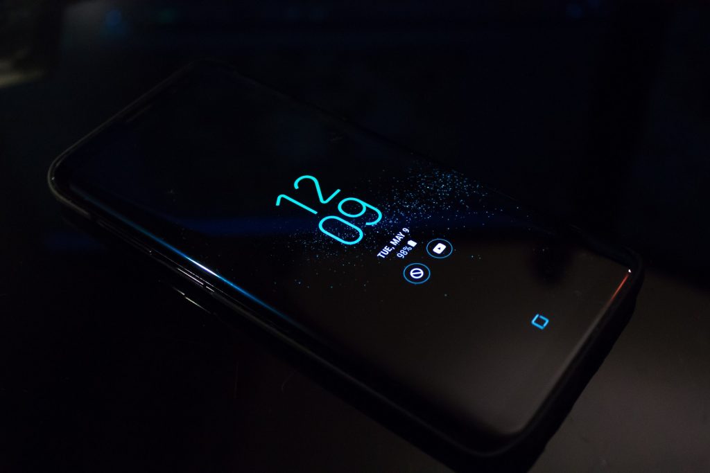
By default, Dark Mode helps to reduce overall screen brightness. Although no study has outrightly confirmed that Dark Mode reduces eye strain, it can, however, be effective in low-light conditions.
Also, Dark Mode helps to reduce exposure to Blue Light. Blue light is a high-frequency colour in the “visible light spectrum” that can be seen by the human eye.

Blue Light can be found almost everywhere, from smartphones to computers and other digital devices. Another source of Blue Light is the sun, so by stepping out of your house, you are exposed to a certain degree of blue light.
Too many exposures to Blue Light can lead to digital eye strain.
Since not everyone can see well with Dark Mode, some mobile devices provide the option for Blue Light filters. This can be found in the display settings area and can be easily adjusted to the level of blue light exposure you want.
4). Reduction of Photophobia
Photophobia is a symptom of abnormal intolerance to the visual perception of light. The source of this light could be any form of light source including sunlight.
There are so many things that can cause photophobia, some of which includes:
- Excessive light entering the eyes
- Eye infection
- Medications
- Meningitis
- Lack of eye pigment (Albinism)
- Wearing contact lenses for an extended period of time, or wearing it wrongly.
- Post Eye Surgery
Photophobia usually disappears once the underlying cause is treated. A good way to deal with photophobia is making use of the Dark Mode of a mobile device or an application. This helps to reduce the amount of bright light that goes directly into the eyes.
An extension you may consider installing on your desktop browser is Night Eye. It is supported by almost all major web browsers. It helps you enable Dark Mode and other features across almost all the websites you view, to help cope with the light sensitivity.
However, if light sensitivity persists, you may want to see your doctor!
5). Battery Saver
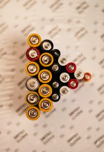
Another positive impact of Dark Mode is the impact it has on the battery life of mobile devices. Dark Mode can significantly help reduce the battery drain on devices which use OLED(Organic Light-Emitting Diode) screens.

Numerous studies have confirmed the fact that Dark Mode saves battery life. In an Android Dev Summit in November of 2018, Google also confirmed that themes on android devices have a significant impact on the battery life of a mobile device.
If you are using an Android device, you should consider using Dark Mode, especially at night. Not only is it easy on the eyes, but it also helps save your battery life.
Factors To Consider When Selecting Dark Mode
In as much as Dark Mode seems trendy, it is necessary to consider some factors before deciding to implement it in an application. Some of these factors are discussed below:
Readability and Visibility: Readability simply means the ease at which a reader can easily understand or perceive a written text. Applications that contain lots of text in their interface will have to be careful about how Dark Mode is implemented.
If the Dark Mode is not well implemented, this will lead to a poor user experience with the users struggling to read the texts. This defeats one of the purposes for which Dark Mode is created and could lead to eye strain.
Lots of research must go into how the backgrounds, text colour and font will work together.
Test Before Implementation: Testing helps to discover the strength and weakness of the Color scheme used in an application. Dark Mode does not work well for all applications. A website that contains lots of elements(text, images, tables) may make it difficult for Dark Mode to be implemented.
Other factors to consider include:
- Determination of the target audience
- Providing an option to switch between Light Mode and Dark Mode
- The Environment
- Accessibility
Conclusion
The decision to always use Dark Mode should always be a relative one. For users of an application, knowing when to use light mode and Dark Mode at different times of the day is very essential for the eye.


In 1, you don’t show the “light mode” variant, or explain why it’s any less attractive. It’s a mediocre designer who thinks the only alternative to “dark mode” is “drab white”.
2 just sounds like a rephrasing of 1.
3 is better solved at the OS level, as you yourself point out. But recent studies have suggested it’s not really as big a problem as originally thought, anyway.
4 could be a good reason, but designers are promoting “dark mode” for accessibility reasons while ignoring users who need bigger text, higher contrast, color distinctions other than red-green, headlines that work in screen readers, etc., so I have trouble believing they’re suddenly concerned about accessibility in this one area only, which just so happens to coincide with what they think looks cool this year.
This page, for example, ignores “prefers-color-scheme”, and the little “Dark” toggle to switch to dark mode has a text/background contrast ratio of only 2.2 — less than half of the recommended minimum, for any size text. Can any of your photophobia sufferers even *see* this?
5 is one of those cases that’s technically true but such a small fraction of energy consumption it’s just not worth spending effort implementing. The typical webpage would have a much larger impact if they disabled animations, or removed the 20 tracking scripts. (Or reminded people to check their tire pressure.) I have yet to see any energy profile that shows white pixels are the significant consumer of energy.
You’re starting with a particular technology (dark mode) and then trying to come up with reasons to support it. What you should be doing is starting with goals that users have (like improved accessibility, or saving energy), and then coming up with the most efficient ways to achieve those. Developer time is fungible. Implementing dark mode takes away from something else. Saving 10% on battery life for the 50% of people with OLEDs sounds good until you discover you could save 20% for everybody by fixing your JS.