What we know matters but who we are matters more.
–
Introduction
Today we are going to build a simple registration form. The requirements for this tutorial is just Html, CSS and a code editor.
As we all know, this is a new blog and I aim to start with very basic topics before moving to more advanced ones.
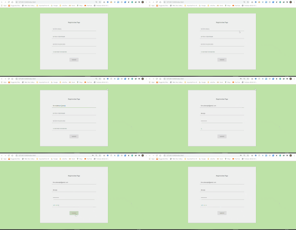
A Preview of What We Are Going To Build

Let us get started.
Code Structure
First, in our code editor, we are going to create a new folder. We can call the folder form. Inside that folder, we will create two files. The index.html and the style.css.
HTML
In the index.html file, we should have a bare bone structure similar to what is shown below:
<!DOCTYPE html>
<html lang="en">
<head>
  <meta charset="UTF-8">
  <meta name="viewport" content="width=device-width, initial-scale=1.0">
  <title>Registration Form With Html & Css</title>
  <link rel="stylesheet" href="style.css">
  <meta name="viewport" content="width=device-width, initial-scale=1">
</head>
<body>
</body>
</html>
Next, I am going to add the tags to the HTML page.
<!DOCTYPE html>
<html lang="en">
<head>
  <meta charset="UTF-8">
  <meta name="viewport" content="width=device-width, initial-scale=1.0">
  <title>Registration Form With Html & Css</title>
  <link rel="stylesheet" href="style.css">
  <meta name="viewport" content="width=device-width, initial-scale=1">
</head>
<body>

<div>

  <form>
    <h4 class="text-warning text-center pt-5">Registration Page</h4>

    <label>
     <input type="text" class="input" name="email" placeholder="EMAIL"/>
        <div class="line-box">
          <div class="line"></div>
        </div>
    </label>

    <label>
     <input type="text" class="input" name="username" placeholder="USERNAME"/>
        <div class="line-box">
          <div class="line"></div>
        </div>
    </label>

    <label>
     <input type="password" class="input" name="password" placeholder="PASSWORD"/>
        <div class="line-box">
          <div class="line"></div>
        </div>
    </label>

    <label>
     <input type="password" class="input" name="confirm" placeholder="CONFIRM PASSWORD"/>
      <div class="line-box">
        <div class="line"></div>
      </div>
    </label>

    <button type="submit">submit</button>
  </form>
</div>
 </body>
</html>
From the code above, we started by adding a form tag. In the form tag, there are four label tags and a button tag. Each input tag is wrapped in a label.
These labels are very important because they tell the user what information to provide in the form element.
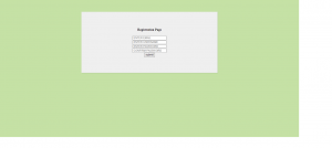
This is all we need for the Html code and our form should look something like this:

Yes, that is ugly. Time for some CSS!
CSS
We start in the style.css file by adding colour to the background of the page and also styling the form tag:
body {
  background: #C5E1A5;
}

form {
  width: 30%;
  margin: 60px auto;
  background: #efefef;
  padding: 60px 120px 80px 120px;
  text-align: center;
  -webkit-box-shadow: 2px 2px 3px rgba(0,0,0,0.1);
  box-shadow: 2px 2px 3px rgba(0,0,0,0.1);
}
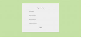
The Outcome:

Furthermore, we need to style the labels and input. For the label, we will be adding letter-spacing, color, margin, padding and a positional direction for the label and the texts that will be within it.
label {
  display: block;
  position: relative;
  margin: 40px 0px;
}

.label-txt {
  position: absolute;
  top: -1.6em;
  padding: 10px;
  font-family: sans-serif;
  font-size: .8em;
  letter-spacing: 1px;
  color: rgb(120,120,120);
  transition: ease .3s;
}


.input {
  width: 100%;
  padding: 10px;
  background: transparent;
  border: none;
  outline: none;
}
The Outcome:

Finally, we will be styling the line for the input field and the button.
To get the line effect, we need to set the height in the .line-box class. This will make the line visible. Also, we will be adding some transition effect when the input field is active.
The design for the button class is straight forward, We added a hover color, a background color, padding and border–radius. We also set the display to inline-block, this allows us to set padding to the side of the button.
.line-box {
  position: relative;
  width: 100%;
  height: 2px;
  background: #BCBCBC;
}

.line {
  position: absolute;
  width: 0%;
  height: 2px;
  top: 0px;
  left: 50%;
  transform: translateX(-50%);
  background: #8BC34A;
  transition: ease .6s;
}

.input:focus + .line-box .line {
  width: 100%;
}

.label-active {
  top: -3em;
}

button {
  display: inline-block;
  padding: 12px 24px;
  background: rgb(220,220,220);
  font-weight: bold;
  color: rgb(120,120,120);
  border: none;
  outline: none;
  border-radius: 3px;
  cursor: pointer;
  transition: ease .3s;
}

button:hover {
  background: #8BC34A;
  color: #ffffff;
}
Final Results:

Conclusion
I know this is a very basic tutorial, but I hope you can learn one or two things from it.
Here is the link to the repo on Github.
Support me by subscribing to my newsletter here.
