Never bend your head. Always hold it high. Look the world straight in the eye.
– Helen Keller
Table of Contents
Introduction
A Date Picker is a form of graphical user interface that allows users to select a date from a calendar and/or time from a time range. The common practice in which a date picker is implemented is by providing a text-box field, which when clicked upon to enter a date, displays a pop-up calendar, such that when one of the characters on the calendar is selected, it displays the value inside the text input field.
Some of the advantages of using a date picker include:
- Entering dates becomes easier for the user and you can control the format of the data you receive.
- Only valid dates can be entered.
- Dates are properly formated to avoid confusion.
- Date Pickers can help users out by including common holidays, for instance depending on the country chosen and integration of their own calendar.
- Making the user enter a date by merely clicking on a date in the pop-up calendar as opposed to having to take their hand off the mouse to type in a date, reducing the chances of error in the process.
In this tutorial, we will take a look at the top ten date pickers in react, using the estimated weekly downloads from the least number to the most on NPM.
10). @y0c/react-datepicker
This date picker is a flexible, reusable, mobile-friendly DatePicker component for React. Its previous versions rely on moment.js, but now it is changed to Day.js because of bundle size issues.
Brief Overview:
Version
1.0.4
License
MIT
Estimated-Weekly -Downloads
677
Unpacked-size
154kb
Link To Repository
@yoc/react-date picker
Code Demo / Example
In this short tutorial, I’ll be showing us how we can install, display and get the values of the date that is selected in the DatePicker.
Step 1
We will need to install React, this can be done trough Create-React-App. I wrote an article on how to install it here.
Once that is done, we will need to navigate into the path of our folder in our terminal and run the npm command to install our Date-Picker package:
npm i @y0c/react-datepicker
Step 2
import React from "react";
import { DatePicker, RangeDatePicker } from "@y0c/react-datepicker";
import "@y0c/react-datepicker/assets/styles/calendar.scss";

const YocReactDatePicker = () => {
  const onChangeValue = (date) => {
    const dateValue = date.toDate();
    console.log(dateValue);
  };

  const onChangeRangeValue = (title) => (...date) => console.log(date);

  return (
    <div>
      <h1>YOC DatePicker Example</h1>
      <DatePicker onChange={onChangeValue} />

      <br />
      <br />
      <h1>YOC Date Range Picker Example</h1>
      <RangeDatePicker onChange={onChangeRangeValue("date")} />
    </div>
  );
};

export default YocReactDatePicker;
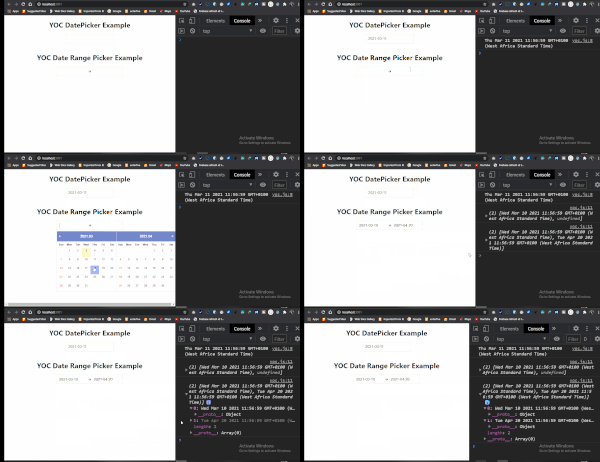
What we did here was to create a new file. After this, we had to import React, DatePicker, RangeDatePicker as well as the assets for the CSS.
Next, we created a functional component that has two variables. The first one is called onChangeValue which takes in an argument, while the second one is called onChangeRangeValue. These variables allow us to log the data for the date in the console.
Finally in our code, we display the date pickers by calling both the <DatePicker onChange={onChangeValue} /> and the <RangeDatePicker onChange={onChangeRangeValue(“date”)} /> that was imported earlier.
Each one has an onChange prop that takes in the variables that we created earlier.
Result
Possible Errors
There is a chance you may get an error that says, ERROR Cannot find module ‘node-sass’. All you have to do when you get this error message is to run the command npm install node-sass in your terminal or command line.
9). materialui-daterange-picker
This is a react date range picker that makes use of @material-ui. Material-UI is the most popular React component library, with millions of users worldwide.
Brief Overview:
Version
1.1.92
License
MIT
Estimated-Weekly -Downloads
5,135
Unpacked-size
1.12 MB
Link To Repository
Code Demo / Example
In this short tutorial, I’ll be showing us how we can install, display and get the values of the date that is selected in the DatePicker.
Step 1
We will need to install React, this can be done trough Create-React-App. I wrote an article on how to install it here.
Once that is done, we will need to navigate into the path of our folder in our terminal and run the npm command to install our Date-Picker package:
npm i materialui-daterange-picker
Step 2
import React from "react";
import { DateRangePicker } from "materialui-daterange-picker";

const MaterialUiDateRange = () => {
  const [open, setOpen] = React.useState(true);

  const toggle = () => {
    setOpen(open);
  };


  const setDateRange = (date) => {
    console.log(date.startDate, date.endDate);
    alert(date.startDate, date.endDate);
  };
  return (
    <div>
      <h1>Material UI Date Range</h1>
      <DateRangePicker
        open={open}
        toggle={toggle}
        onChange={(date) => setDateRange(date)}
      />
    </div>
  );
};

export default MaterialUiDateRange;
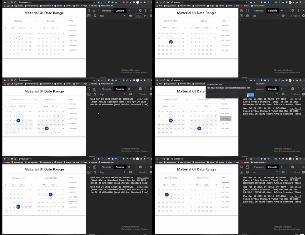
Here we import React and the DateRangePicker as expected. Then we created a functional component. In this component, we declared a React hook called useState that takes in a variable(open) and a function(setOpen).
We state the useState to true by default because that is how our date picker will get displayed on the page.
Next up, we assigned an anonymous function to a variable called toggle. This makes sure that our date picker is always open no matter the state.
We then create another variable called setDateRange. This variable takes in an anonymous function that logs and alert the value of the date selected. We get the value for both the start date and the end date.
Finally in our return, we assign each props in the <DateRangePicker /> component to each of the variables.
Result
8). React-DateTime-Picker
This is a fast, lightweight and easy to style date picker that only provides support for modern browsers. It is only compatible with 16.3 or later. If you use an older version of React, please refer to the table below to find a suitable React-DateTime-Picker version.
| React version | Newest compatible React-DateTime-Picker version |
|---|---|
| ≥16.3 | latest |
| ≥16.0 | 2.x |
Brief Overview:
Version
3.1.0
License
MIT
Estimated-Weekly -Downloads
20,973
Unpacked-size
193 kB
Link To Repository
Code Demo / Example
In this short tutorial, I’ll be showing us how we can install, display and get the values of the date that is selected in the DatePicker.
Step 1
We will need to install React, this can be done trough Create-React-App. I wrote an article on how to install it here.
Once that is done, we will need to navigate into the path of our folder in our terminal and run the npm command to install our Date-Picker package:
npm i react-datetime-picker
Step 2
import React, { useState } from 'react';
import DateTimePicker from 'react-datetime-picker';

const ReactDateTimePicker = () => {

  const [value, onChange] = useState(new Date());

  const getDateValue = (value) => {
    onChange(value)
    console.log(value)
    alert(value)
  }


  return (
    <div>
      <h2>React Date Time Picker</h2>
      <DateTimePicker
        onChange={getDateValue}
        value={value}
      />
    </div>
  )
}

export default ReactDateTimePicker
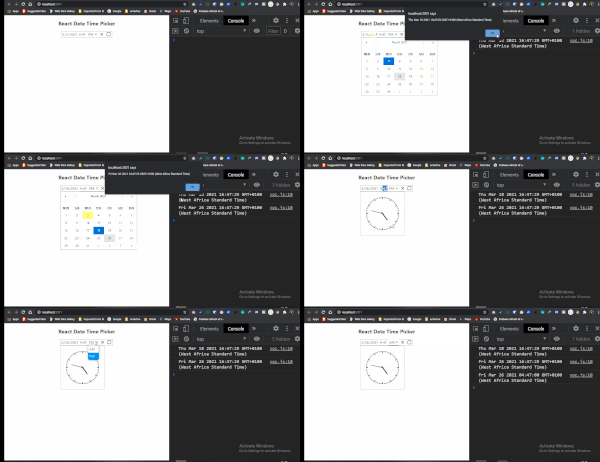
From the above, we import React, useState and DateTimePicker, then we created a functional component. Then we declared a React hook called useState that takes in a variable(value) and a function(onChange).
The value takes in the value of the current date which will be displayed by default in the input field.
Next up we created a variable called getDateValue. This variable takes in an anonymous function that enables us to log and alert the value of the selected date. Also, the onChange function is called inside the anonymous function, this makes the date values in the input field change based on the date that was selected.
Lastly, in our return, we pass in the variables to the props inside the <DateTimePicker /> component.
Result
7). react-date-range
This is a React Date Picker component for choosing dates and date ranges. It makes use of date-fns for date operations. Some of the qualities of this date picker include:
- Stateless date operations
- Highly configurable
- Multiple range selection
- Based on native js dates
- Drag n Drop selection
- Keyboard friendly
Brief Overview:
Version
1.1.3
License
MIT
Estimated-Weekly -Downloads
63,883
Unpacked-size
1.92 MB
Link To Repository
Code Demo / Example
In this short tutorial, I’ll be showing us how we can install, display and get the values of the date that is selected in the DatePicker.
Step 1
We will need to install React, this can be done trough Create-React-App. I wrote an article on how to install it here.
Once that is done, we will need to navigate into the path of our folder in our terminal and run the npm command to install our Date-Picker package:
npm i react-date-range
Step 2
import React, { useState } from "react";
import "react-date-range/dist/styles.css"; // main style file
import "react-date-range/dist/theme/default.css"; // theme css file
import { Calendar } from "react-date-range";

const ReactDateRange = () => {

  const handleSelect = (date) => {
    console.log(date);
    alert(date);
  };


  return (
    <div>
      <h2>React Date Range</h2>
      <Calendar date={new Date()} onChange={handleSelect} />
    </div>
  );
};

export default ReactDateRange;
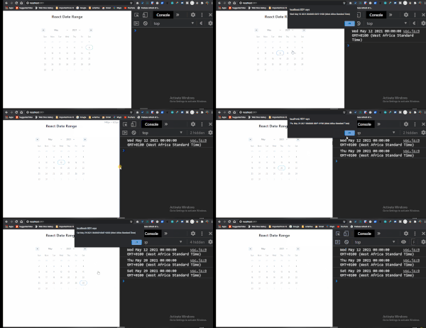
The first thing we did was import React, the CSS files for the theme and also the necessary component from react-date-range.
Next, we created a function called handleSelect, that helps log the date values to the console.
Finally, in our return, our first component called <Calendar /> we declared some props and assigned some variables to it. The first is the date prop that takes in a new Date value, second is the onChange prop that takes in the handleSelect variable that logs out the date values to the console.
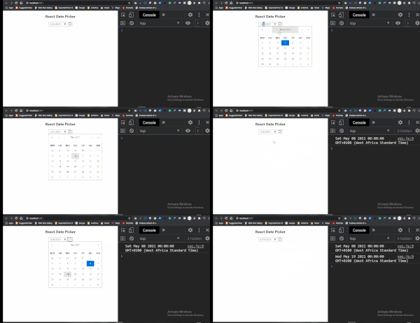
6). react-date-picker
This is a fast, lightweight and easy to style date picker that only provides support for modern browsers. With this date picker you can pick days, months, years, or even decades.
It is only compatible with 16.3 or later. If you use an older version of React, please refer to the table below to find a suitable React-DateTime-Picker version.
| React version | Newest compatible React-Date-Picker version |
|---|---|
| ≥16.3 | latest |
| ≥16.0 | 7.x |
Brief Overview:
Version
8.0.7
License
MIT
Estimated-Weekly -Downloads
78,779
Unpacked-size
209 kB
Link To Repository
Code Demo / Example
In this short tutorial, I’ll be showing us how we can install, display and get the values of the date that is selected in the DatePicker.
Step 1
We will need to install React, this can be done trough Create-React-App. I wrote an article on how to install it here.
Once that is done, we will need to navigate into the path of our folder in our terminal and run the npm command to install our Date-Picker package:
npm i react-date-picker
Step 2
import React, { useState } from "react";
import DatePicker from "react-date-picker";

const ReactDatePicker = () => {
  const [value, onChange] = useState(new Date());

  const dateValue = (range) => {
    onChange(range)
    console.log(range);
    alert(value);
  };

  return (
    <div>
      <h2>React Date Picker</h2>
      <DatePicker onChange={dateValue} value={value} />
    </div>
  );
};

export default ReactDatePicker;
From the above, we import React, useState and DatePicker, then we created a functional component. Next, we declared a React hook called useState that takes in a variable(value) and a function(onChange).
The value takes in the result of the current date which will be displayed by default in the input field.
Next up we created a variable called dateValue . This variable takes in an anonymous function that enables us to log and alert the value of the selected date. Also, the onChange function is called inside the anonymous function, this makes the date values in the input field change based on the date that was selected.
Lastly, in our return, we pass in the variables to the props inside the <DatePicker /> component.
Result
5). react-big-calendar
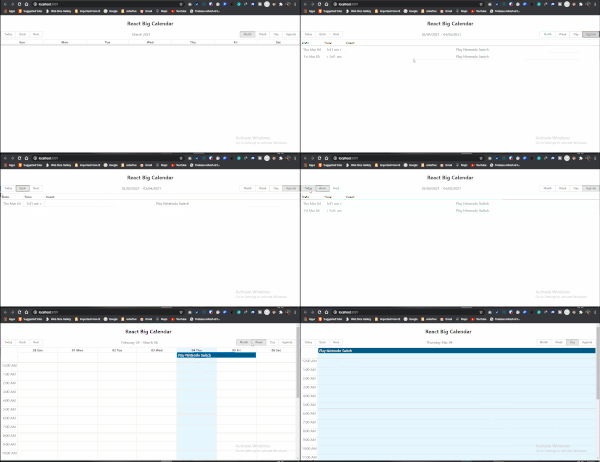
This is an events calendar component built for React and made for modern browsers (read: IE10+) and uses flexbox over the classic tables-based approach.
react-big-calendar makes use of three options for handling the date formatting and culture localization, depending on your preference of DateTime libraries. You can use either the Moment.js, Globalize.js or date-fns localizers.
Brief Overview:
Version
0.32.0
License
MIT
Estimated-Weekly -Downloads
126,292
Unpacked-size
1.13 MB
Link To Repository
Code Demo / Example
In this short tutorial, I’ll be showing us how we can install, display and get the values of the date that is selected in the DatePicker.
Step 1
We will need to install React, this can be done trough Create-React-App. I wrote an article on how to install it here.
Once that is done, we will need to navigate into the path of our folder in our terminal and run the npm command to install our Date-Picker package:
npm i react-big-calendar
Step 2
import React from "react";
import { Calendar, momentLocalizer } from "react-big-calendar";
import moment from "moment";
import "react-big-calendar/lib/css/react-big-calendar.css";

const ReactBigCalendar = () => {
  moment.locale("en-GB");
  const localizer = momentLocalizer(moment);

  const myEventsList = [
    {
      start: moment().toDate(),
      end: moment().add(1, "days").toDate(),
      title: "Play Nintendo Switch",
    }
  ];

  return (
    <div>
      <h2>React Big Calendar</h2>
      <Calendar
        localizer={localizer}
        events={myEventsList}
      />
    </div>
  );
};
export default ReactBigCalendar;
From the above, we import React, the necessary dependencies from react-big-calendar, moment.js as well as the needed CSS assets.
Next up we set the structure for moment.js, after which we declare a variable called myEventsList. This variable contains an array of objects that sets a start-date, end-date as well as the title of the event to take place on those days.
Finally, we return our <Calendar /> component which contains the props in which we passed the date and also the list of events.
Results
4). react-datetime
This Date-Picker can be used as a date picker, time picker or both at the same time. It is highly customizable and it even allows to edit date’s milliseconds.
Brief Overview:
Version
3.0.4
License
MIT
Estimated-Weekly -Downloads
207,604
Unpacked-size
296 kB
Link To Repository
Code Demo / Example
In this short tutorial, I’ll be showing us how we can install, display and get the values of the date that is selected in the DatePicker.
Step 1
We will need to install React, this can be done trough Create-React-App. I wrote an article on how to install it here.
Once that is done, we will need to navigate into the path of our folder in our terminal and run the npm command to install our Date-Picker package:
npm i react-datetime
Step 2
import React from "react";
import "react-datetime/css/react-datetime.css";
import Datetime from "react-datetime";

const ReactDateTime = () => {
  let setDateTime = (e) => {
    const dateValue = e.toDate();
    console.log(dateValue);
    alert(dateValue)
  };
  return (
    <div>
      <h2>React Date Time</h2>
      <Datetime value={setDateTime} input={false} onChange={setDateTime} />
    </div>
  );
};

export default ReactDateTime;
Here we import React, the CSS assets and Datetime from the react-datetime library.
Inside our functional component, we created a variable called setDateTime. This variable takes in an anonymous function that will display the values of the date both inside the browser console and the alert box.
Finally, in our return, we create our <Datetime /> component and assign the necessary props to it, which makes our date-picker functional.
Results

3). react-day-picker
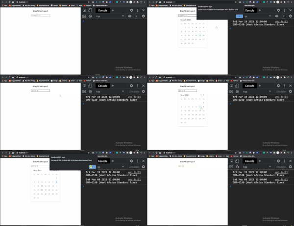
This is a date-picker that is highly customizable, localizable, with ARIA support, no external dependencies.
Brief Overview:
Version
7.4.8
License
MIT
Estimated-Weekly -Downloads
454,148
Unpacked-size
686 kB
Link To Repository
Code Demo / Example
In this short tutorial, I’ll be showing us how we can install, display and get the values of the date that is selected in the DatePicker.
Step 1
We will need to install React, this can be done trough Create-React-App. I wrote an article on how to install it here.
Once that is done, we will need to navigate into the path of our folder in our terminal and run the npm command to install our Date-Picker package:
npm i react-day-picker
Step 2
import React from "react";

import DayPickerInput from "react-day-picker/DayPickerInput";

import "react-day-picker/lib/style.css";

const ReactDayPicker = () => {

  const onDayChangeInput = (day) => {
    console.log(day);
    alert(day)
  };

  return (
    <div>
      <h3>DayPickerInput</h3>
      <DayPickerInput
        placeholder="DD/MM/YYYY"
        format="DD/MM/YYYY"
        onDayChange={onDayChangeInput}
      />
    </div>
  );
};

export default ReactDayPicker;
From the above code, we import React, the DayPickerInput and the CSS assets.
In our functional component, we created a variable called onDayChangeInput. Inside this variable is an anonymous function that logs the date valued to the console as well as showing an alert box.
Then finally, in our return, we include the props in our <DayPickerInput /> component.
Result
2). @material-ui/pickers
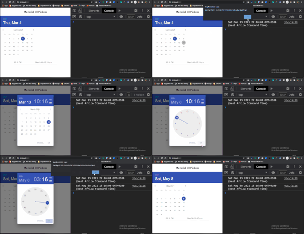
This date-picker is an accessible, customizable, delightful date & time pickers for React. It is one of the most high-quality date-picker out there.
It is based on Material-UI, the world’s most popular React component library.
Brief Overview:
Version
3.2.10
License
MIT
Estimated-Weekly -Downloads
608,421
Unpacked-size
1.49 MB
Link To Repository
Code Demo / Example
In this short tutorial, I’ll be showing us how we can install, display and get the values of the date that is selected in the DatePicker.
Step 1
We will need to install React, this can be done trough Create-React-App. I wrote an article on how to install it here.
Once that is done, we will need to navigate into the path of our folder in our terminal and run the npm command to install our Date-Picker package:
npm i @material-ui/pickers
Step 2
import React, { useState } from "react";
import DateFnsUtils from "@date-io/date-fns"; // choose your lib
import {
  DatePicker,
  TimePicker,
  DateTimePicker,
  MuiPickersUtilsProvider,
} from "@material-ui/pickers";

const MaterialUiPickers = () => {
  const [selectedDate, handleDateChange] = useState(new Date());

  const dateChangeValue = (date) => {
    handleDateChange(date);
    const dateValue = date;
    console.log(dateValue);
    alert(dateValue);
  };

  return (
    <div>
      <h2>Material UI Pickers</h2>
      <MuiPickersUtilsProvider utils={DateFnsUtils}>
        <DatePicker
          variant="static"
          value={selectedDate}
          onChange={dateChangeValue}
        />
        {/* <br /> */}
        <TimePicker value={selectedDate} onChange={dateChangeValue} />
        <DateTimePicker value={selectedDate} onChange={dateChangeValue} />
      </MuiPickersUtilsProvider>
    </div>
  );
};

export default MaterialUiPickers;
The code above shows how we import the necessary dependencies to run the project.
Then in our functional component, we created a useState hook that has a variable and a function called selectedDate and handleDateChange respectively.
Next, we created a variable called dateChangeValue that holds an anonymous function. Inside this function we do three things:
- We call the handleDateChange function from our useSate, this helps us update the change event on the date-picker, shown on the page.
- Next up we log and alert the value of the date that is clicked on the date-picker.
Finally. in our return, we have a <DatePicker />, <TimePicker /> and a <DateTimePicker />. Each of these components takes in props like value and onChange that have the appropriate variables assigned to them.
Result
Possible Errors
There is a possibility you run into this error: Module not found: Can’t resolve ‘@date-io/date-fns’
When that happens, you can run the following commands to solve the issue:
$ npm i --save date-fns@next @date-io/date-fns@1.x
1). React Date Picker
Brief Overview:
Version
3.6.0
License
MIT
Estimated-Weekly -Downloads
835,537
Unpacked-size
509 kB
Link To Repository
Code Demo / Example
In this short tutorial, I’ll be showing us how we can install, display and get the values of the date that is selected in the DatePicker.
Step 1
We will need to install React, this can be done trough Create-React-App. I wrote an article on how to install it here.
Once that is done, we will need to navigate into the path of our folder in our terminal and run the npm command to install our Date-Picker package:
npm i react-datepicker
Step 2
import React, {useState} from "react";
import DatePicker from "react-datepicker";

import "react-datepicker/dist/react-datepicker.css";

const ReactDatePicker = () => {
  const [startDate, setStartDate] = useState(new Date());

  const getDateValue = (date) => {
    setStartDate(date);
    console.log(date)
    alert(date)
  }
  return (
    <div>
      <h2>React Date Picker</h2>
      <DatePicker
        selected={startDate}
        onChange={getDateValue}
      />
    </div>
  );
};

export default ReactDatePicker;
Above we import all the necessary dependencies. Then in the functional component, we create a useState hook. This hook takes in a variable and a function called startDate and setStartDate respectively.
Next, we create a variable with an anonymous function called getDateValue.
In this variable, the setStartDate function from the useState is updated with the value of the current date as they change on the page. We also log and alert the date values on the console.
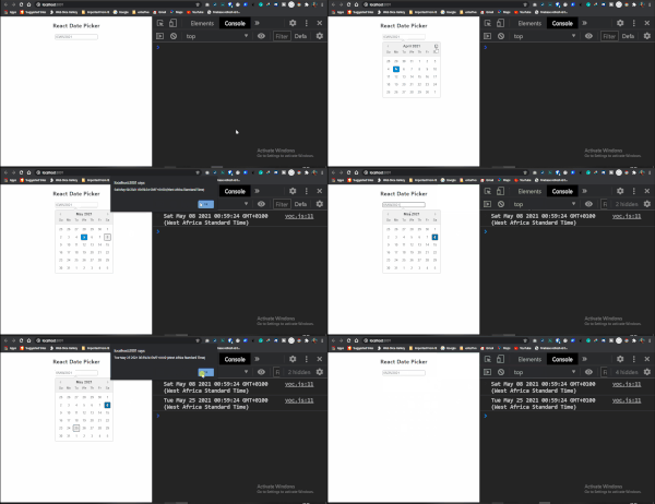
Finally in our return, we declare our <DatePicker /> component and assign the necessary props to it.
Result
Conclusion
So that is it for the top Date pickers in React. Date pickers are very popular and important components in the Frontend Development world. It is really great that we have so many Date Pickers out there, and we can easily implement anyone that seems like the right fit for our project.
If you have any difficulties in implementing any of the Date Picker discussed above, feel free to drop your issue in the comment section.
Also if you are looking for an open-source project to contribute, a lot of the above Date Pickers provide an excellent opportunity for you to do so.
Also, here is the GitHub link to the code examples used in the article.
Subscribe to my Youtube Channel for more tutorials on web development content.
